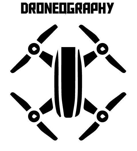
For this project I decided to create a logo for my drone hobby/future business. If I ever start a droneography business I would use a similar logo as a watermark in all the photos I take. I wanted to replicate an image of the drone I own. So, I traced an image of a drone and created a vector out of it. The logo I created replicates that of my DJI spark drone.
I want to keep my logo simple so all that is in the logo is text that says “droneography” and a small image of my drone. After getting feedback from my peers I will alter my logo slightly but for the most part I want to keep it as it is because it would be used as a watermark.
I have played around with different fonts, but I like this blocky one I am using. I also used the same font in my last Photoshop project when I used it as the tittle for my magazine. I decided in Keeping the same font because it looks futuristic or very techy in my perspective.
For my final draft I might add a gradient on the logo or more text like “est. 2018” or something like that. I really liked the cougar logo we created in the tutorials. I will attempt to do something along those lines for my final draft but for this first draft I will keep it just black until I find some colors I like.
I have looked at photos of friends who have started photography businesses and for the most part the watermarks on their photos are very simple. They have their signature or just a small image on them. For my draft I might scan an image of my signature and put it in the center of my drone. I am still deciding on how to finalize this project.
Right off the bat, I really like your design. I like how is is simple and very clean. The text that you used also seems to go very well with the image. I am interested in how you actually created your design. I do like the simplicity of the design especially since it’s a design that will being going on drones. I am not sure if this would help or hurt your design, but I think that adding some sort of color in there somewhere might help it. maybe just making the middle section of the design a different color. Or just adding a splash of color in there somewhere. Even if you decided to add your signature to the design, could maybe sign your signature a different color. Like I said before, I appreciate the simplicity of design, but with the whole design just being black and white, I think it might be too simple.
LikeLike
Your Logo is extremely simple, it does go straight to the point in which you are presenting. I like how realistic it is, and how you kept it all one color. Some critical suggestions I could give you would be to add more elements what would shock the viewer. For example, I think it would be a great aspect to have an element in your design what is hidden within it, how FEDEX has a hidden arrow between the E and X. It would be cool and eye catching if you could add something like that to your logo. I also think it would be good to add the steps you did to make this logo in your writing. You just have a few simple improvements to better on, over all this is a great start to your draft logo.
LikeLike
Juan! I think you did an awesome job with this project. It is very clear what your logo is, and it is very clean. I love that you are using this as a stepping stone for possibly starting your own company. It is very inspiring to see people doing what they love! Overall, I think you captured the idea for your logo perfectly. The strongest part of your logo is that if you were to be using it as a watermark for a photograph, you should leave it as is. When putting watermarks on photos you want them to be simple, so they do not take away from the photograph itself, and you did that perfectly! But if you were to use this as a logo on billboards or for other advertisement, it would be nice to see some color to draw people’s attention to it. Also, I like your idea of adding a signature or something more personal, helps to make people connect with it more! Overall, I think you are on your way to an awesome final draft.
LikeLike
I really like what you have done with this logo project. I like how spaced out it is and how clean it looks. One thing that i would recommend is adding a little bit more color to the logo to make it pop a little more. One thing that might help is if you just make a one solid color background and have the black logo stand out over it. Otherwise i like what you have going and i cant wait to see the finished product.
LikeLike